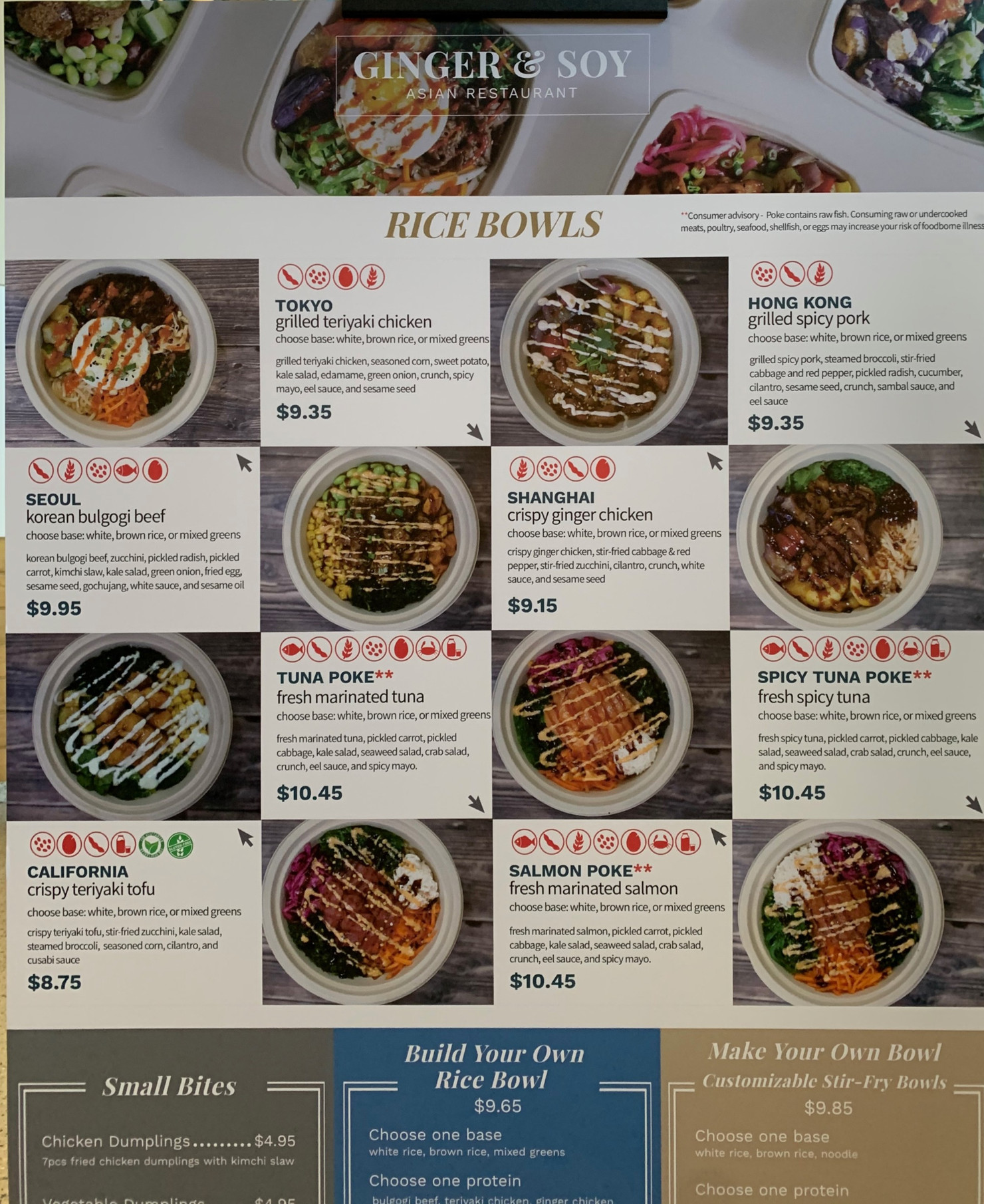

One of my design reflections that I greatly disliked and yet still come across daily during lunch is Ginger & Soy's Rice Bowls poster (included a pic below for quick reference). I recall looking at this poster for a longer time that usual and noticing the mouse arrows pointing in all sorts of directions in a grid with many descriptions and pictures of rice bowls. Yet.. it made my decision of choosing something new to try very difficult (and I recall it being quite exhausting for my eyes to try to match the arrows to the picture.
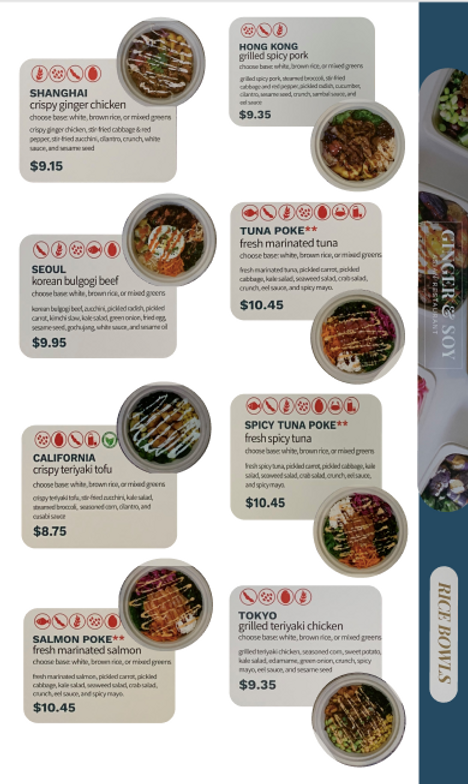
That is why I wanted to take this month's design challenge as an opportunity to redesign this poster interface. In doing so, I sought to tackle the main issue with the layout clarity and then aesthetic. In doing so, I was able to utilize less space than the actual poster to showcase the rice bowls section in a manner that was no longer dependent on arrows and instead allowed the viewer's eyes to fall to the nearest picture of the bowl after reading its description or visa versa.
As a designer, I was missing a variety of elements such as quality uncropped images of the bowls, text content for the descriptions, meaning of the red symbol icons and ability to relocate them, and ability to edit/increase font choice. I was only limited to the original image of the poster that I took, which I individually cropped the images and description elements from. If I had more time and resources under my hand, I would start of with zooming out on the images to properly display the whole bowl, explore different font choices, edit elements of the description box, and try out other layout options. In this design instance, my criteria for "better" means: +Easy depiction of bowl + description + eye-catching and CLEAN design (not too compact like the original) + Visually pleasing to view + Fitting depiction of logo and title of Rice Bowls + (If have access to) the inclusion of the other deals section on the bottom of the original poster